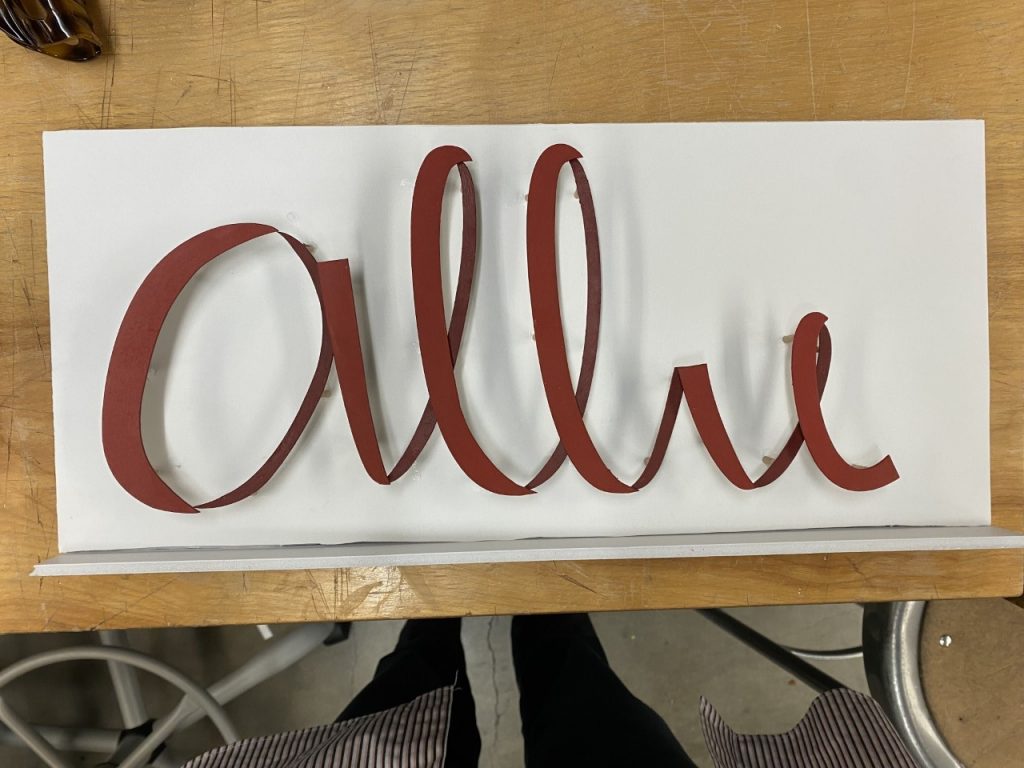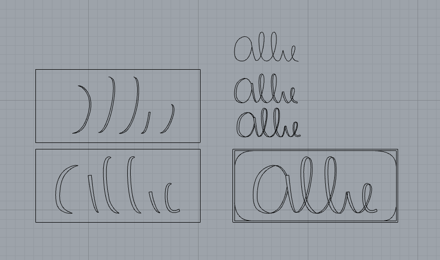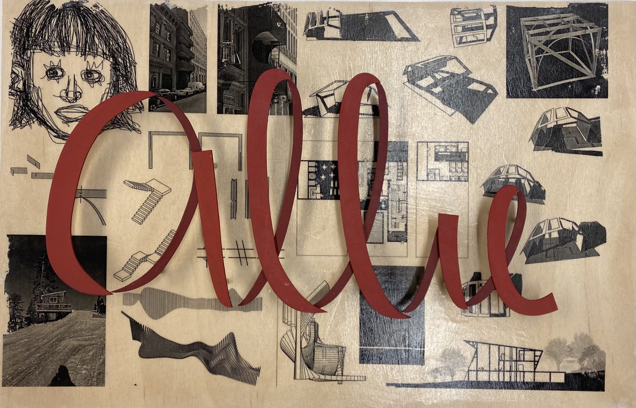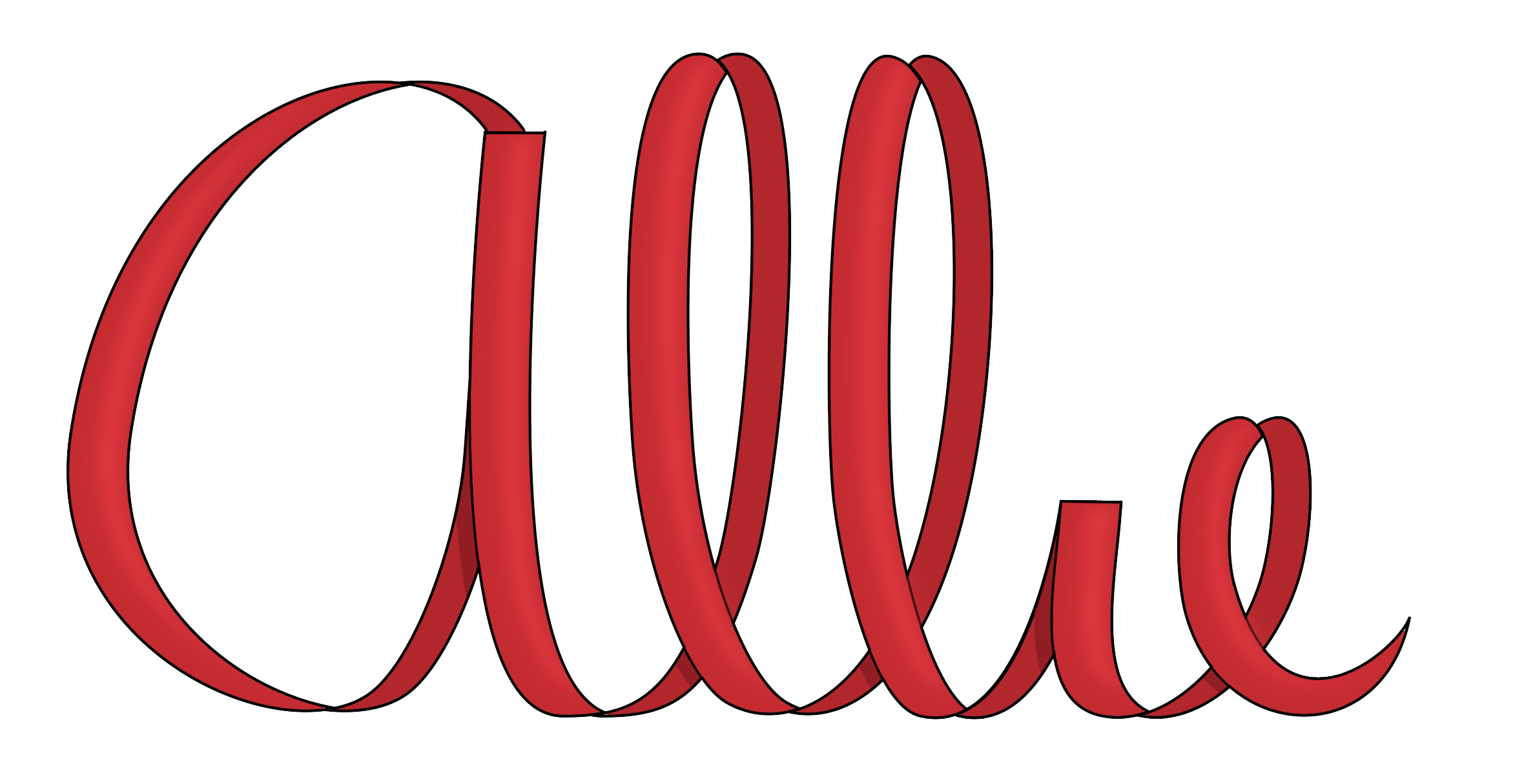


To practice branding strategies for our studio project, our class was challenged to create personal logos. For my logo simplicity was my first focus, to reflect my value of efficiency and intentional design; I always liked the simplicity of the delicate loops of my name written in cursive. But I wanted to highlight the geometry of these feminine forms, I did so by separating the individual strokes. Lastly, I filled in the logo with red, a classic, attention-grabbing color with personal significance.
